Updating the MacSpecialist Brand Identity
Because a large portion of our target market was comprised of advertising and marketing agencies, I knew that if I wanted them to take us seriously, our brand identity had to be on par with their own.
Luckily, we had a few people in the building who were also graphic designers. I chose Glen (if I’m being honest, I always chose Glen because I swear, he could see inside of my brain). So, I sat down with Glen and explained my vision, if you can call it that. It went something along the lines of:
“We’re asking Fortune 500 companies, ad agencies, video production houses and rockstars to choose us to be their Mac provider— over Apple. If we’re going to convince them to do that, we need a logo that says we’re a modern company staffed by Apple experts who aren’t Apple— we’re better than Apple. We don’t want it to look like a college student designed our logo— and it can’t be purple— and blue is a confidence color.”
I know. Science, right? Just kidding. Go easy. I was new to this.
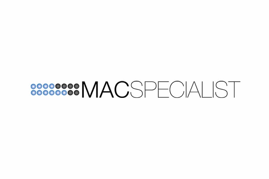
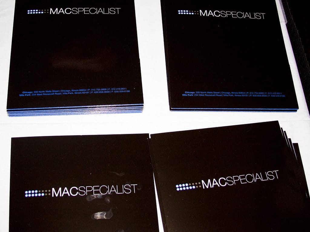
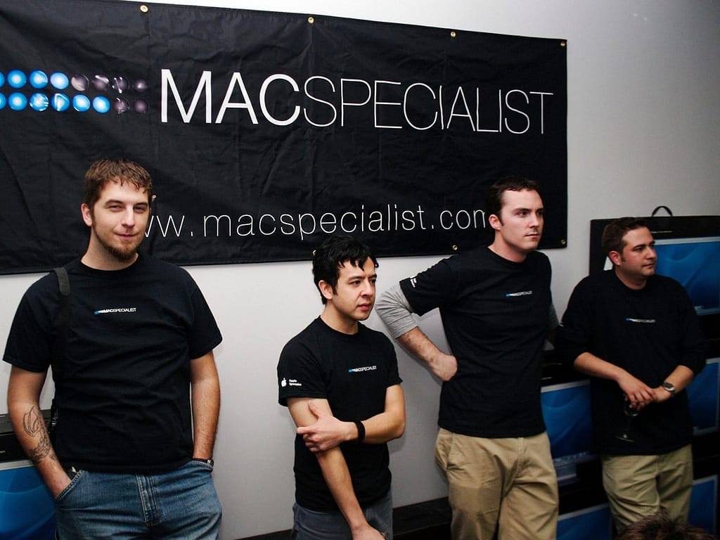
The new logo
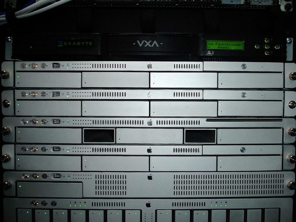
A few days later, he came back with about 6 or 7 options. One of the options was the Helvetica Neue font with “MACSPECIALIST” typed in all caps with “MAC” bolded. It also had two horizontal rows of blue and black dots/circles that looked like the LEDs on the front of an Xserve (Apple’s rack-mount server). I loved those damned dots but more importantly, it hit the mark:
- New (anything would have been new)
- Modern (I mean, look at it. It’s still awesome today.)
- Expert (xserve)
- Confident (caps)
- Blue
Next, I proceeded to convince our staff that blue Helvetica Neue Xserve was clearly the best choice. After that, we put the logo options up for a company-wide vote. Unsurprisingly, my “persuasion” paid off. We had ourselves a logo that was instantly recognizable to anyone who knew what an Xserve was. For everyone else, we had an Apple logo next to our name on the sign and our promo materials anyway.
MacSpecialist wasn’t just under new management. It was completely different.
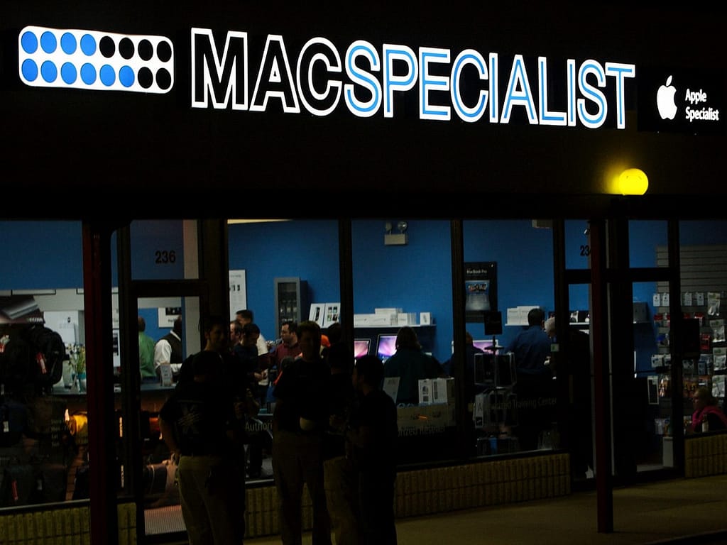
Now that we had a logo, we could use it as a foundation to develop a color scheme for everything else. We determined that the blue in Apple’s LEDs, light gray and black would complement the aluminum and white colors of Apple’s professional product line nicely.
We applied the logo and color scheme to the following:
- the sign on the building
- bright blue and light grey paint on the walls
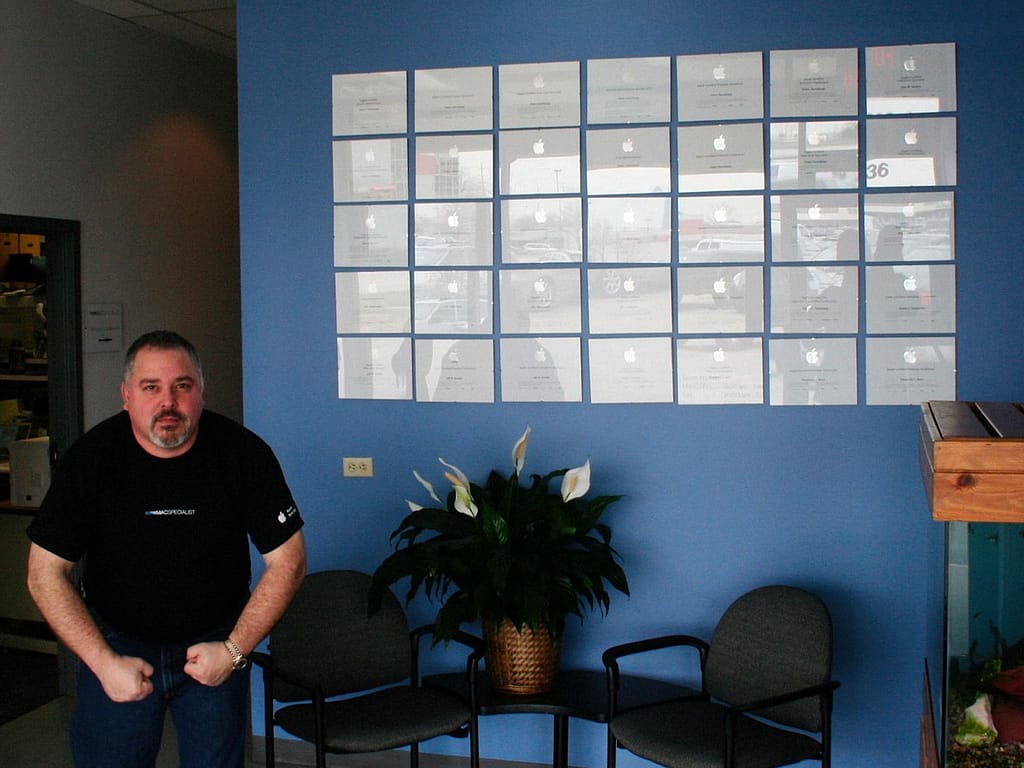
- t-shirts for our retail sales reps
- polos for our technicians, trainers and engineers
- price lists
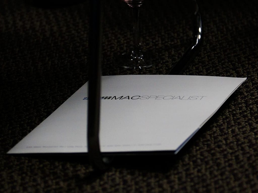
- brochures
- folders
- desktop images on the demo computers
- website
- digital marketing materials
- banners
You get the idea. It wasn’t long before we presented a completely redesigned storefront where anyone who walked through the doors was met by a friendly MacSpecialist team member who knew more about the Mac than anyone at any Apple Store in Chicago.

Updating the MacSpecialist brand identity made an immediate statement: MacSpecialist wasn’t just under new management. MacSpecialist was completely different.
More posts in this series:
MacSpecialist Brand Development